How-to
How to Test Paint Colors Before You Commit: 7 Methods
A routine that narrows ten colours to two before you buy a single sample pot. The AI visualiser is the quick first pass, not the final say.
L’équipe Miradora8 min de lecture
Les articles sont publiés en anglais uniquement.
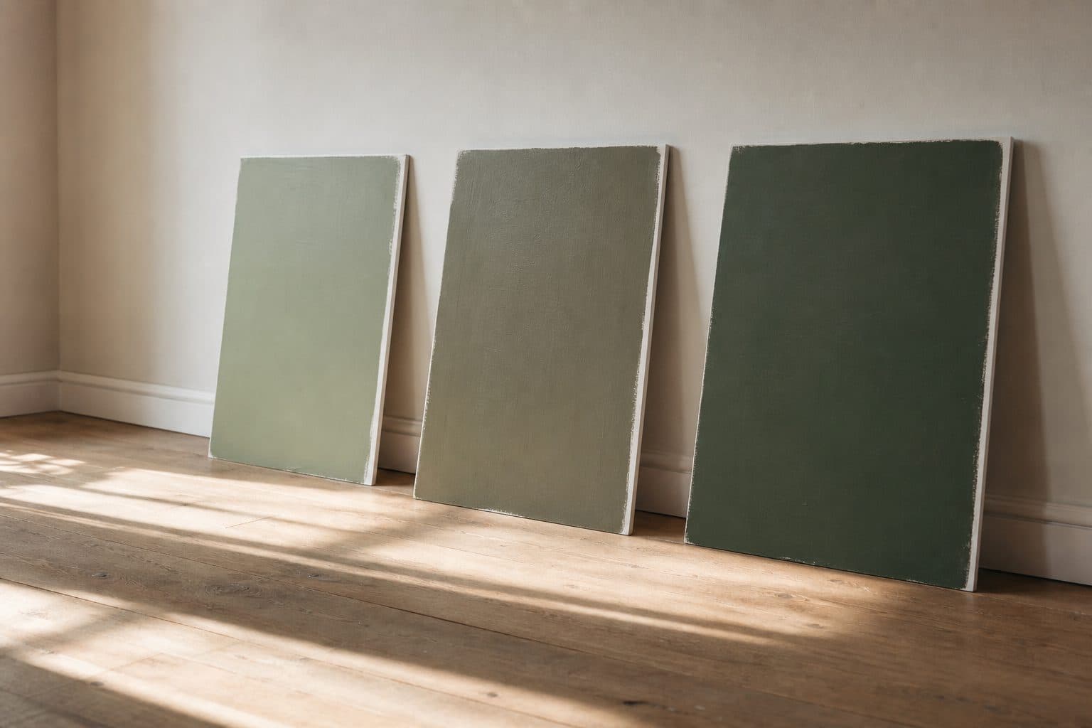
The reliable way to test paint colours is in two rounds. First, cut the long list down without buying anything: work out which way the room faces, compare each candidate's undertone and light reflectance value (LRV), and preview the shortlist on a photo of your own wall. Then buy sample pots for two or three finalists only, paint large boards, and move them round the room in morning light, afternoon light and after dark. A screen can tell you which colours to drop. Only real paint, dry, on your walls, can tell you which one to keep.
Key takeaways
- Work out which way the room faces before you look at a single chip. North light is cooler; south light is warmer for most of the day.
- Compare undertones side by side and check each colour’s LRV, so you know how light or dark it will read in your room.
- Use a paint visualiser to shortlist, not to decide. Screen colour differs from real paint.
- Paint two coats on a large board, let it dry completely, then look at it on several walls and again after dark.
- Buy the full tins only once a finalist has survived all of that.
How to test paint colors: ten down to two
Methods 1 to 4 below cost little or nothing and happen before you buy a sample pot. Their job is to take ten hopefuls down to two or three. Methods 5 to 7 test those finalists, and they are the only ones that show you the real paint.
1. Read your light first
Paint has no fixed colour in a room: it takes on the light that reaches it. So before you open a fan deck, note which way the main window faces and when you use the room.
Farrow & Ball's guide to how light affects colour says northern light brings out a colour's cooler tones. For pale shades in a north-facing room it suggests avoiding blue- or grey-based colours in favour of yellow-based ones, or embracing the cool light with a deep shade. Put that together with Sherwin-Williams' notes on light and colour and each direction behaves roughly like this:
| Room faces | What the light does | What to test |
|---|---|---|
| North | Cool and bluish | Warmer undertones for pale colours, or a deliberately deep shade |
| South | Warm, orange-yellow light for most of the day | Soft, pale colours, cool blues included, which hold up well here |
| East | Warm and bright before noon, cooler later | Judge it at the time of day you use the room |
| West | Cooler in the morning, warm orange-red after noon | Check at breakfast and again in late afternoon |
South of the equator
These rules assume the northern hemisphere. In the southern hemisphere the sun sits in the northern sky, so swap north and south in the table. Near the equator, check the room at the times you use it.
Bulbs count too. Farrow & Ball notes that halogen and incandescent bulbs make walls look warmer and cool white bulbs make them bluer. If you mostly use the room at night, test under the bulbs you own.
2. Check the undertone, not just the colour
An undertone is the quieter colour sitting under the main one. Two greys can match on the chip, then one leans blue and the other green on the wall. Whites lean yellow, pink, green or blue; greens lean yellow or grey.
Undertones hide in isolation and show by comparison. Lay your chips side by side on plain white paper: the one that looks slightly off is showing its undertone. Then match it to your light. A cool-leaning colour in northern light looks cooler still, and a warm-leaning one in strong southern light can drift towards yellow.
3. Use LRV to predict how light or dark it will read
Light reflectance value is a number many paint brands publish for each colour. Sherwin-Williams explains it in the same article on light and colour: it measures how much light a colour reflects, and lighter colours have higher values than darker ones. It helps in two ways:
- It predicts how a colour behaves in a dim room. A low-LRV colour absorbs more of what little light there is, so in a north-facing room it reads darker than the chip did under bright shop lighting.
- It is a fair way to compare. If two greens on your list look alike but their LRVs are far apart, they will not look alike on the wall.
Sheen shifts the result a little. Sherwin-Williams notes that the higher the gloss, the more light bounces off the wall, so the same colour tends to look a touch brighter in satin than in matte.
4. Shortlist on screen, knowing screen colour isn't paint colour
This is where ten becomes three. Previewing colours on a photo of your room is quick, and it is good at one thing: showing you which colours are plainly wrong for the space.
It is bad at the exact colour. Your camera adjusts colour when it takes the photo, your screen adjusts it again, and the photo holds the light of a single moment. Benjamin Moore's guide to paint samples warns that on-screen colour can differ from the real paint. Use any screen, an AI visualiser included, to drop colours, never to pick one.
5. Paint large sample boards, not little wall patches
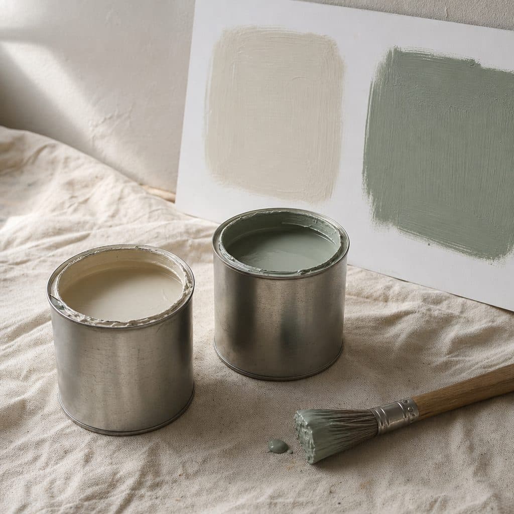
Now buy sample pots, for the finalists only. Benjamin Moore suggests painting white foam-core board, so you can move the colour round the room through the day, with at least two coats brushed out. It says its sample pot covers roughly a 2 ft (60 cm) square in two coats, which is about the right size to judge from across the room.
A board beats a patch on the wall because you can move it, you can hold it against the trim and floor, and it is not surrounded by the old wall colour, which tints how you see the new one. On a wall that is already white or a pale neutral, a patch is fine. Either way, let it dry completely: Dulux points out that wet paint looks very different from dry paint.
6. Test on more than one wall
A board in one spot tells you about one spot. Move each board to every wall the paint will cover: opposite the window, beside it (where the wall sits in its own shadow) and the darkest corner. Dulux suggests testing next to artwork, behind furniture and just above the floor, which is where the colour will actually live. Hold it against what you are keeping, too: the skirting, the floor, the sofa. A colour that works on its own but fights the oak floor does not work.
7. Look again after dark
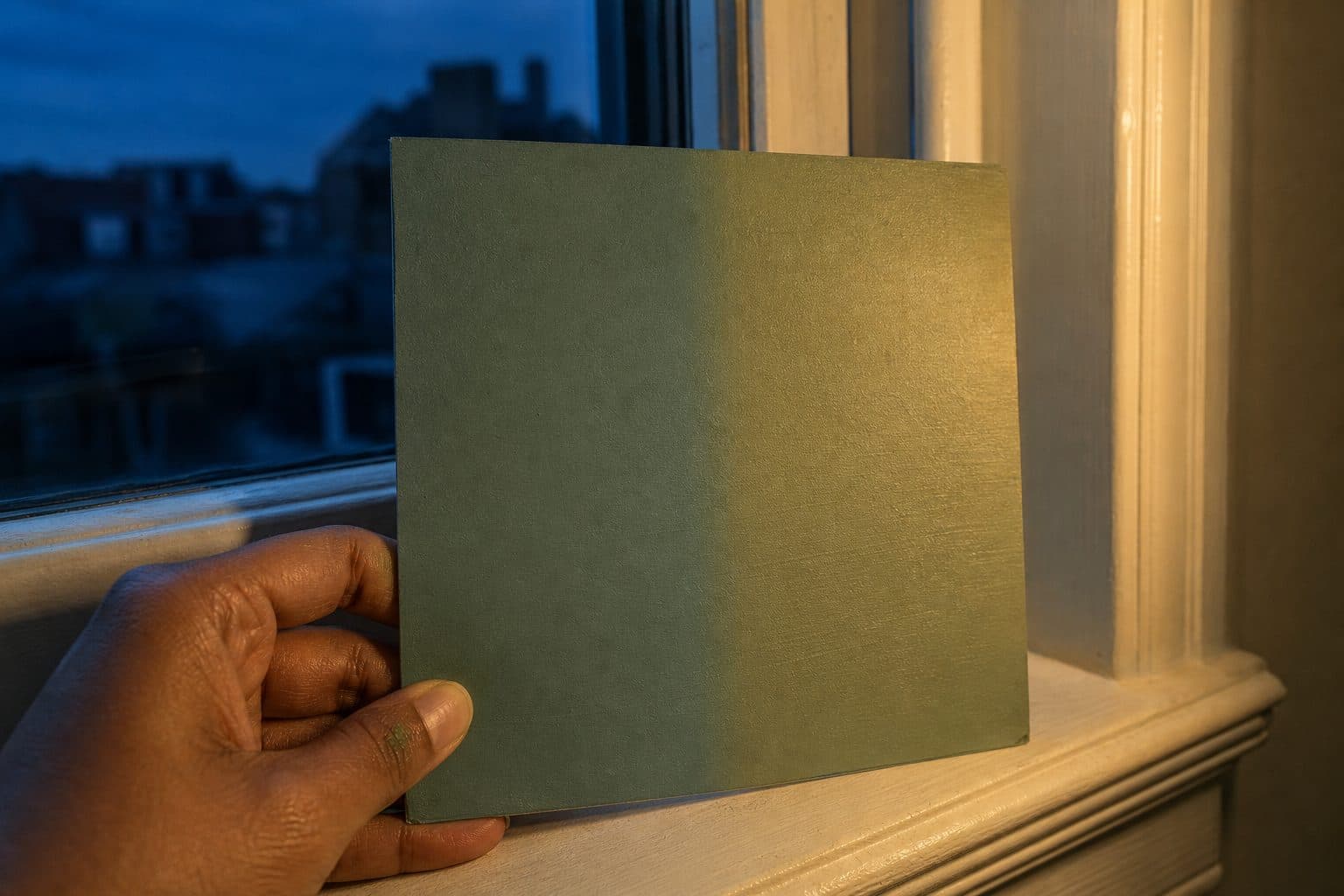
Evening is where good colours go wrong. Check the boards in the morning, in the afternoon and after dark with the lamps on. Benjamin Moore recommends testing from morning to evening, under both natural and artificial light, and Dulux suggests checking by day and by night. Live with the finalists for a few days if you can: the one you still like on the third evening is the one to buy.
Common mistakes
- Choosing from a screen. Screen colour differs from real paint. A screen can narrow the list; it cannot make the final call.
- One coat, still wet. Two coats, fully dry, or you are judging the wrong colour.
- A small patch in the old colour. The colour around it skews what you see.
- Midday only. Check in the morning, the afternoon and after dark.
- Forgetting the sheen. The same colour tends to read a touch brighter in satin than in matte.
Before you buy the full tins
- The finalist has been seen on every wall it will cover.
- You have looked at it in the morning, the afternoon and after dark.
- Two coats, completely dry.
- It sits well next to the trim, the floor and the biggest piece of furniture.
- You still like it after a few days.
A first pass with a paint color visualizer, in Miradora
Method 4 is where Miradora fits. Its Paint Visualiser mode recolours the walls in a photo of your own room, so you see a candidate next to your own furniture rather than on a chip.
How the pass works
- Take one daylight photo of the room, wide enough to include the window and the trim. Then open the free interior design tool, which starts you with 2 credits and no signup.
- Choose Paint Visualiser and enter the colour's hex value (use the brand's own if it lists one), or get close with the colour picker.
- Pick the finish: matte, eggshell, satin or gloss. It changes the render itself, not just the swatch.
- Leave the structure lock on (it is on by default), which is there to keep the windows and doors where they are. Paint Visualiser only opens the walls and ceiling for repainting; the floor stays as photographed. If built-ins or appliances sit against the wall, tick them in the Keep exactly as-is list too.
- Set variations to 1, then generate. Each variation costs 1 credit, so the 2 free credits cover two colours, one render each. The form starts at 2 variations, which would spend both credits on a single colour.
Holding the floor matters more than it sounds. If a render also shifted the floor tone, you could not tell whether you liked the paint or the new floor. The one thing to check is the ceiling: the mode may repaint it along with the walls, so judge the walls on their own. Why AI room designs move your windows explains why tools change things you did not ask for, and how the lock holds them. For the floor or a rug rather than the walls, the Colours & Textures mode applies a material from Miradora's catalogue instead of a paint colour, also at 1 credit per variation.
What it can't tell you
The render is a prediction made from one photo, in one light, on one screen, with every colour shift your camera and display add. Screen colour differs from real paint. Use the visualiser to get from ten candidates to three, then buy physical samples and do methods 5 to 7.
If the paint is part of a bigger change, see refresh, renovate or remodel for how much the room really needs. There is more on the mode on the Paint Visualiser page, and on everything else Miradora does on the home page.
Frequently asked questions
How long should paint samples dry before you judge them?
Until they are completely dry. Wet paint looks noticeably different from dry paint, so judge only once both coats have dried fully, and check the drying time on the pot. Leaving the boards overnight before you make any decision is a simple rule.
How big should a paint sample be?
Much bigger than a chip. Benjamin Moore says its sample pot covers roughly a 2 ft (60 cm) square in two coats, and a board around that size is large enough to judge from across the room. Paint it on white foam board so you can move it between walls.
Can a paint colour visualiser show me the exact colour?
No. The camera shifts the colour when it takes the photo and your screen shifts it again, so screen colour always differs from real paint. A visualiser is useful for ruling colours out quickly. Always test the finalists with a physical sample in the room.
What paint colours work in a north-facing room?
In the northern hemisphere, north light is cool and brings out the cooler tones in a colour. Farrow & Ball suggests avoiding blue- or grey-based pale shades there and choosing yellow-based ones, or embracing the cool light with a deep colour. In the southern hemisphere, the same applies to south-facing rooms.
Should I paint samples directly on the wall or on a board?
A board is usually better: you can move it to every wall and hold it against the trim and floor. Painting on the wall is fine if the wall is already white or a pale neutral, but over a strong colour the old paint around the patch skews how you see the new one.
Keep reading
Tous les articles
Explainer
Renovate vs Remodel vs Refresh: How to Decide What Your Room Needs
Sort the decision by what physically changes, not by vocabulary, and pick the smallest change that gets you the room you want.
8 min de lecture
Deep dive
How Does AI Interior Design Work? Why Your Windows Move, and How to Stop It
A single strength dial forces a trade-off between moved windows and near-identical rerolls. Here’s how masked generation separates the two, and where it still falls short.
9 min de lecture